
A new version of the Canada Life website was launched in late 2020, but internal stakeholders were worried that it wasn't giving the same experience to everyone who used it, like the previous version did.
Research was conducted and various data sources were examined to determine what was causing the problem. We also came up with some recommendations for how to fix things and make the website even better for both advisers and customers.
The case study presents learnings from different research methods and shows how implementing data-driven recommendations increased engagement by 20% on the site
The insights from this project became instrumental for the Website Realignment project.
The research conducted on canadalife.co.uk showed that while the website was meeting the needs of the Financial Adviser audience, there were still opportunities for improvement. However, the research also revealed more significant issues for the customer audience and their feedback was not as positive as that of the Advisers. Based on these findings, we focused on the customer audience and conducting more in-depth user research to better understand their needs and improve the website for them.
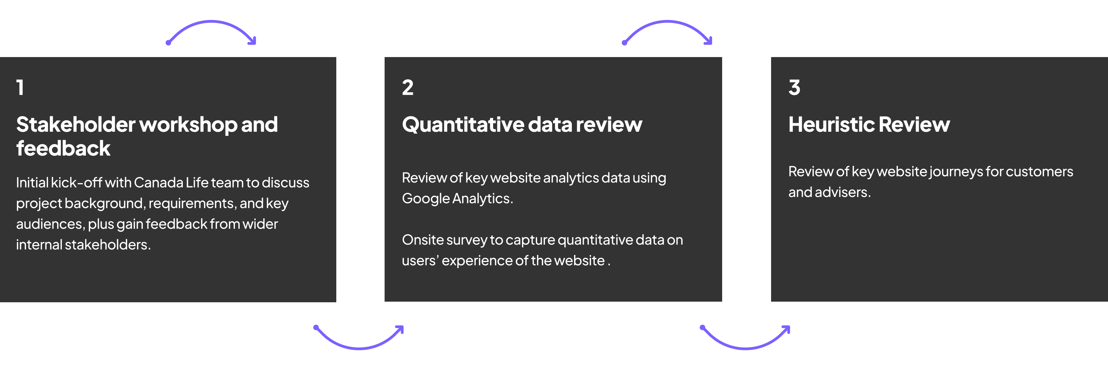
We held a stakeholder workshop and collected other feedback to gain context for the project.
The workshop with stakeholders was used to discuss what they key objectives were for the website, plus who were the different key audiences that are the users. For each of the audience, there was information captured around:
These audiences were identified as:
Feedback
We gathered feedback from various internal stakeholders and departments about different aspects of the website, such as design, content, navigation and search. We collected all of this feedback, organised it by type, and then ranked it in order of priority. I then reviewed this prioritisation with stakeholders and used it as a guide for conducting a Heuristic analysis, focusing on key parts of the audience journeys that needed review.
Started by analysing quantitative data from Google Analytics to understand user behavior on the website. The goal was to identify areas with the most potential for improvement, such as specific pages, sections, or audience segments (such as mobile users). These findings were then used to guide the qualitative phase of the project, ensuring that the focus was on areas where there was the most potential for improvement. This report includes data from the first six months of 2021.
Below is an interactive FigJam project view that I created to collate all the data to present in the workshop:
The content, structure and journey all assume prior knowledge. Often primary details area actively confused due to conflicting information. This means inexpert visitors face a frustrating knowledge gap.
Some questions (i.e. “Is it safe”) are answered through the branding. Other questions are not addressed at all (or worse, the answers are misleading): What is Canada Life? What is it for?What makes it better than alternatives? What do I do next? Why should I do it? What is this product? How does it work? Who is it for? Why do I need it?
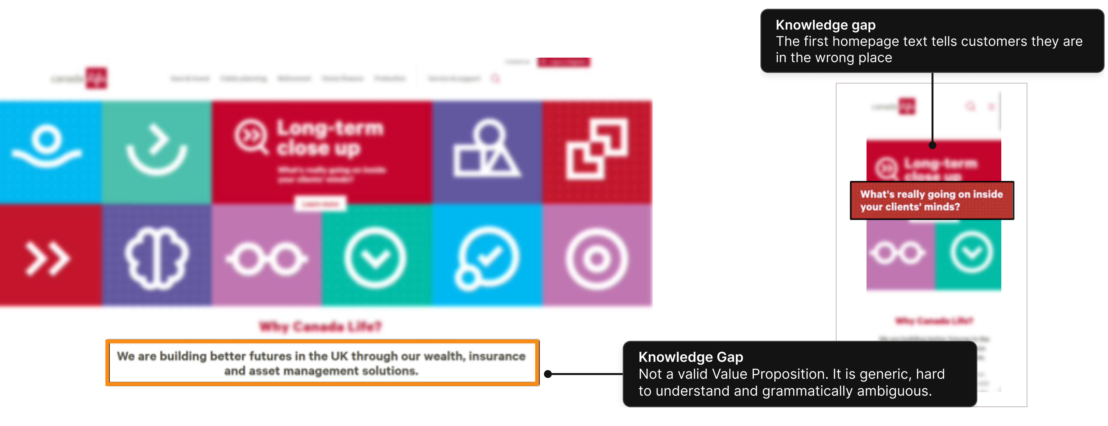
There is no space given to explaining industry terms in surfaced content, which means a user must click to another page – or find their own definition. This is particularly frustrating when unfamiliar labels (like “Protection”) or unique labels (like “CLASS”) are used.

Canadalife.co.uk repeatedly begins UX patterns only to disrupt them. This is true of both design and copywriting.
Patterns reduce Cognitive Load, because they make it easier to sort information. They also convey a relationship between items. When patterns are inconsistent it increases the effort required to access information, causing frustration and reducing trust.
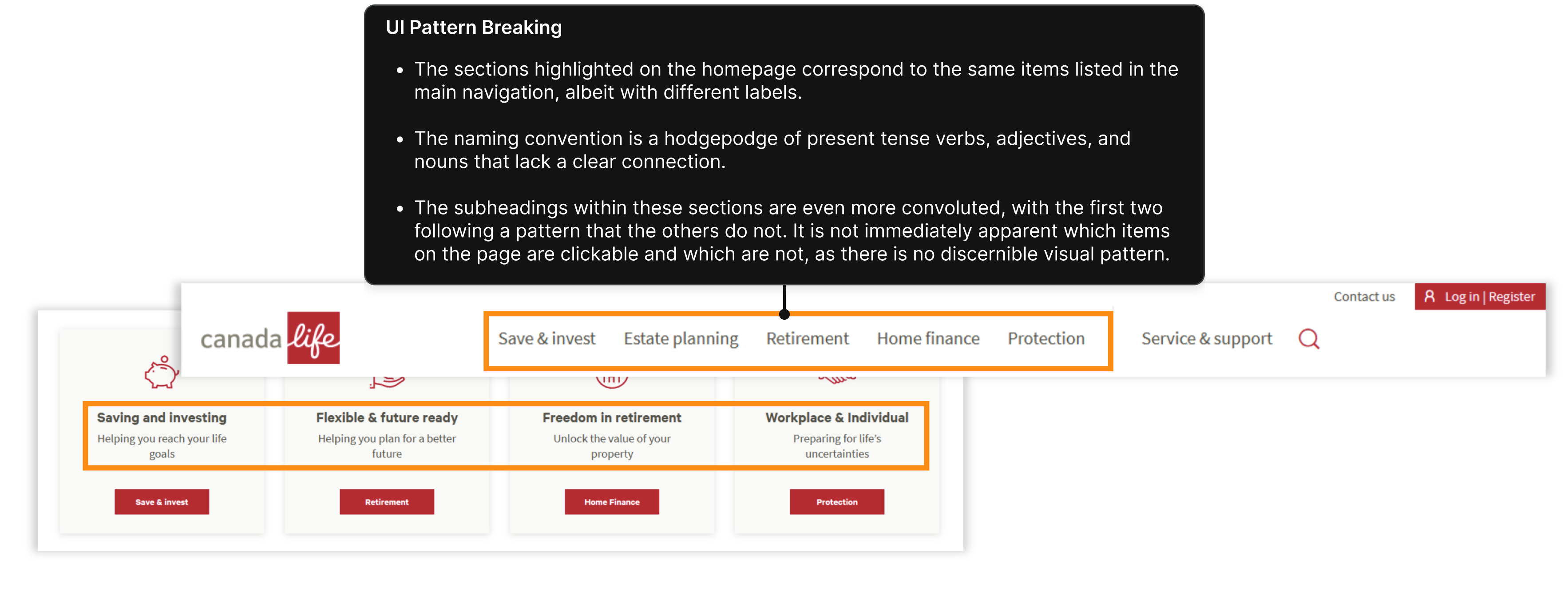
The website Canadalife.co.uk features various types of pages, yet the arrangement or hierarchy of these pages is not readily apparent from the menu, design, titles, or CTAs. It is unclear which pages a customer should visit first or which page would help them achieve their goal. Additionally, there is no clear indication for customers to distinguish between a category page and a product page.
Building around goals
To create a seamless customer journey, it's important to build the website's structure around clear goals. The start and endpoint of the customer journey should be obvious and designed to achieve a specific goal. Visualizing the customer journey can help clarify the information architecture and determine the appropriate call-to-action for each page.
At Canadalife.co.uk, there isn't a clear funnel that represents the complete customer journey. If the objective is for customers to "Get in contact," this should be the primary call-to-action. Alternatively, if the objective is for customers to contact customer support, the contact details should be prominently displayed on the product page rather than being placed on a separate "Customer Support" page.

Ensuring a clear visual hierarchy is essential in creating an effective website. To communicate priority and relationships between elements, established design principles must be utilised throughout the website, including the menu, individual pages, and specific design elements. Without a coherent visual hierarchy, visitors struggle to locate relevant sections, making it challenging for them to navigate the website and find the information they need. This issue is evident in both individual pages and the mega menu on Canadalife.co.uk, demonstrating the importance of prioritising visual hierarchy in website design.

Web pages often follow an inverted pyramid structure, placing important information above the fold because most users do not scroll down further. This is especially crucial for product pages, as visitors may want to compare various options.

The website menu is currently disorganised, overwhelming, and lacks focus
- The "products" section should be prioritised, as it is the site's key content.
- Adviser content, the "Adviser Support" link, and the Document Library should be more visible and differentiated from the other content.
- Some of the product menus are very large and breaks the structure of previous nav menus
- Breadcrumb is only located at the bottom of the page which makes is unusable


